With public transit facing profound challenges due to decreased ridership, our agency created an interactive map of pre-pandemic transit usage in the region.
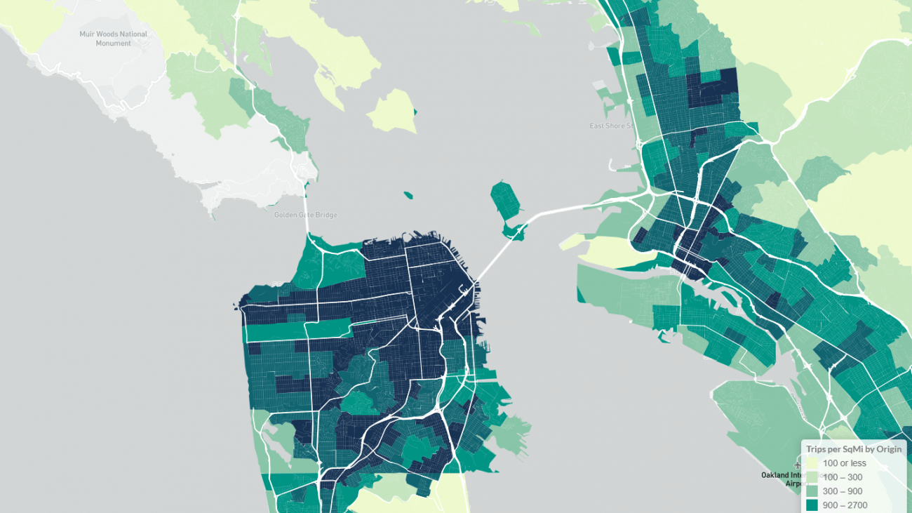
The Bay Area Transit Riders Map shows transit trip patterns across the region, as well as a picture of travel by low-income travelers. This map is based on transit on-board surveys collected by the Metropolitan Transportation Commission and individual transit operators between 2015 and 2019. Check out the map and toggle between data of total rider trips and ridership by income or by transit operator.
This pre-COVID data is the most comprehensive look at Bay Area transit ridership demographics and usage and can help inform transit agencies, policy makers, and the public on who rides transit in the region, as well as guide efforts to support low-income riders who may comprise many of those riding transit today.
One insight the map suggests is that San Francisco’s Muni system carried the largest number and share of low-income transit trips in the region at over 50%. This is more than the amount of low-income riders on all other systems combined. BART and A/C Transit also serve a significant number of low-income riders, including in the inner ring East Bay cities. Our data team will be adding additional views in the coming weeks and months, including the ability to view riders by race, gender, age, and other factors.
Check out other tools we have developed to help policy makers and the public better understand San Francisco’s transportation utilization.