Maps & Data from the Transportation Authority
We map data on transportation projects, congestion, and more to help policy makers and the public better understand the city's transportation network.
COVID-Era Congestion Tracker
Explore how congestion in San Francisco has changed since the March 2020 shelter-in-place order.
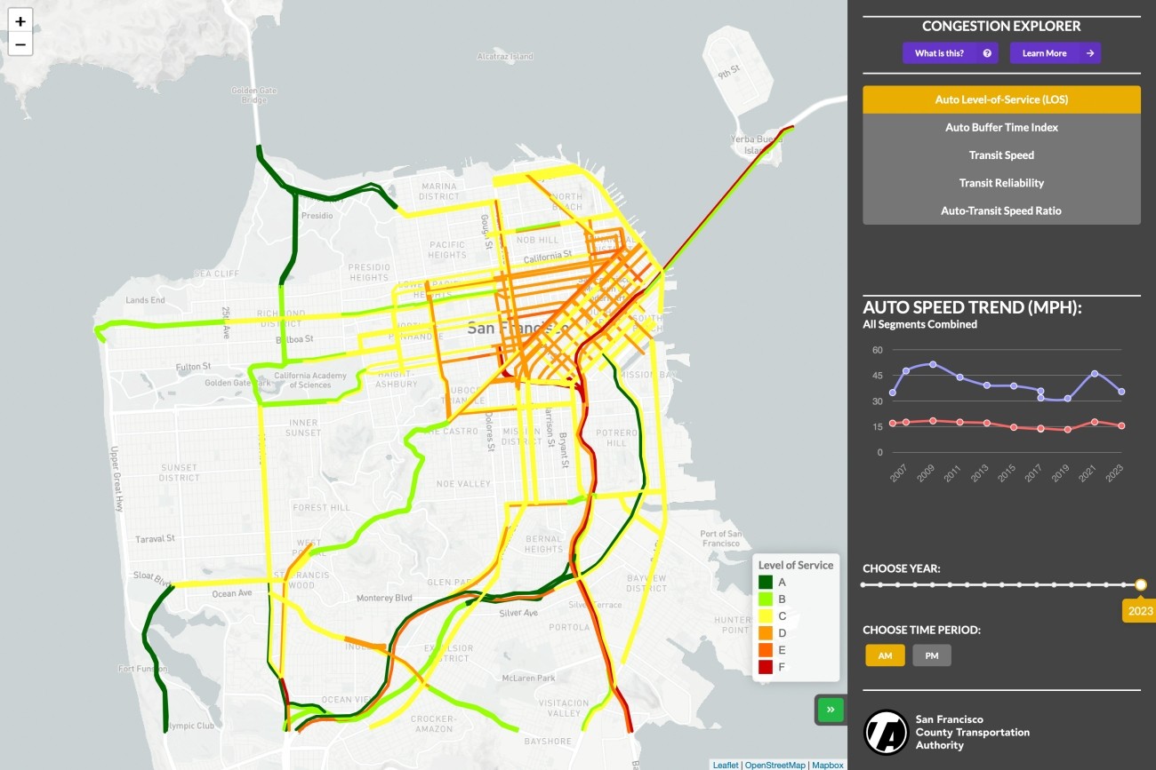
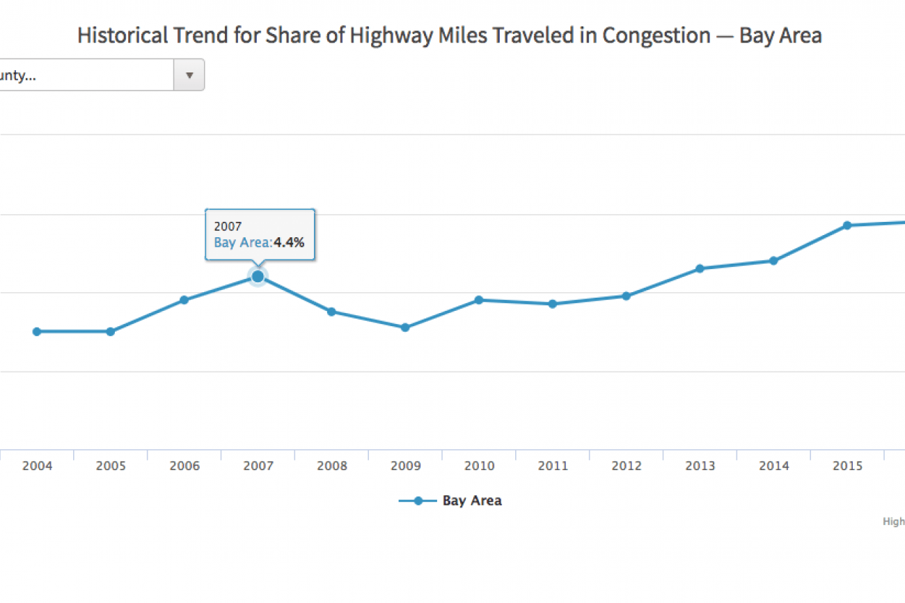
Long-Term Congestion Tracker
Explore how congestion in San Francisco has changed over time.
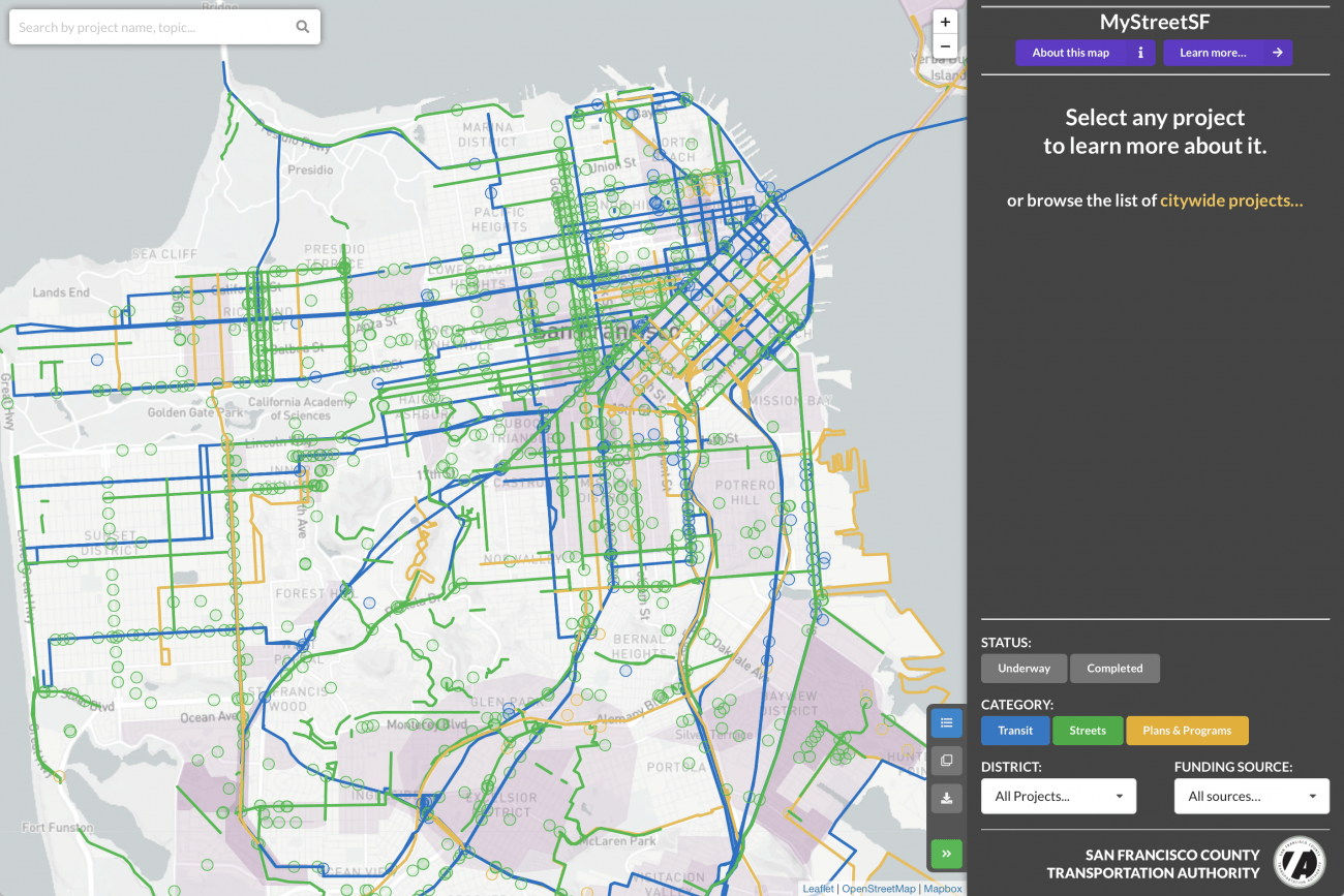
MyStreetSF
View projects that we fund or oversee in our role as the Congestion Management Agency for San Francisco.
TNCs 2020: A Profile of Ride-Hailing in California
The San Francisco County Transportation Authority has released “TNCs 2020: A Profile of Ride-Hailing in California,” the first comprehensive study of ride-hailing activity statewide, based on an analysis of annual reports filed by Uber and Lyft to the California Public Utilities Commission.
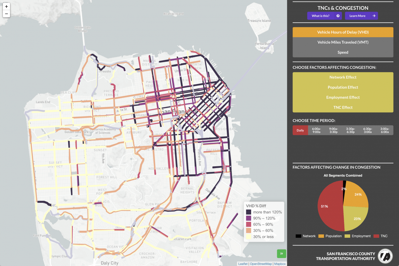
TNCs and Congestion
Explore how ride-hail companies Uber and Lyft have affected congestion in San Francisco.
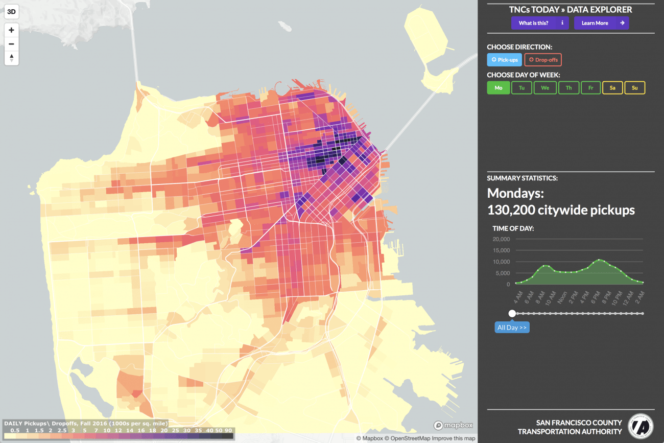
TNCs Today (2017)
View ride-hail vehicle activity in San Francisco by time of day and time of week.
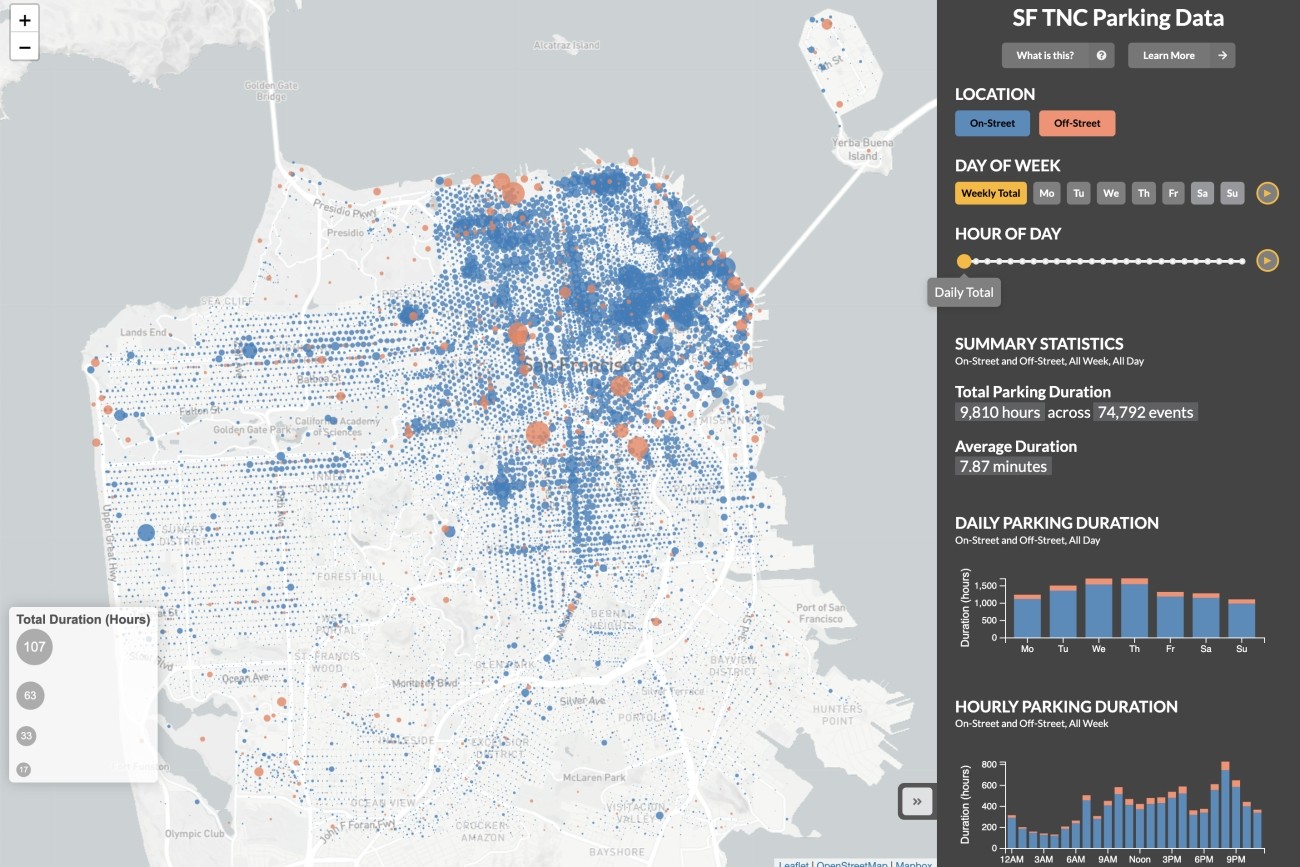
TNC Parking
View ride-hail parking activity in San Francisco by time of day and time of week.
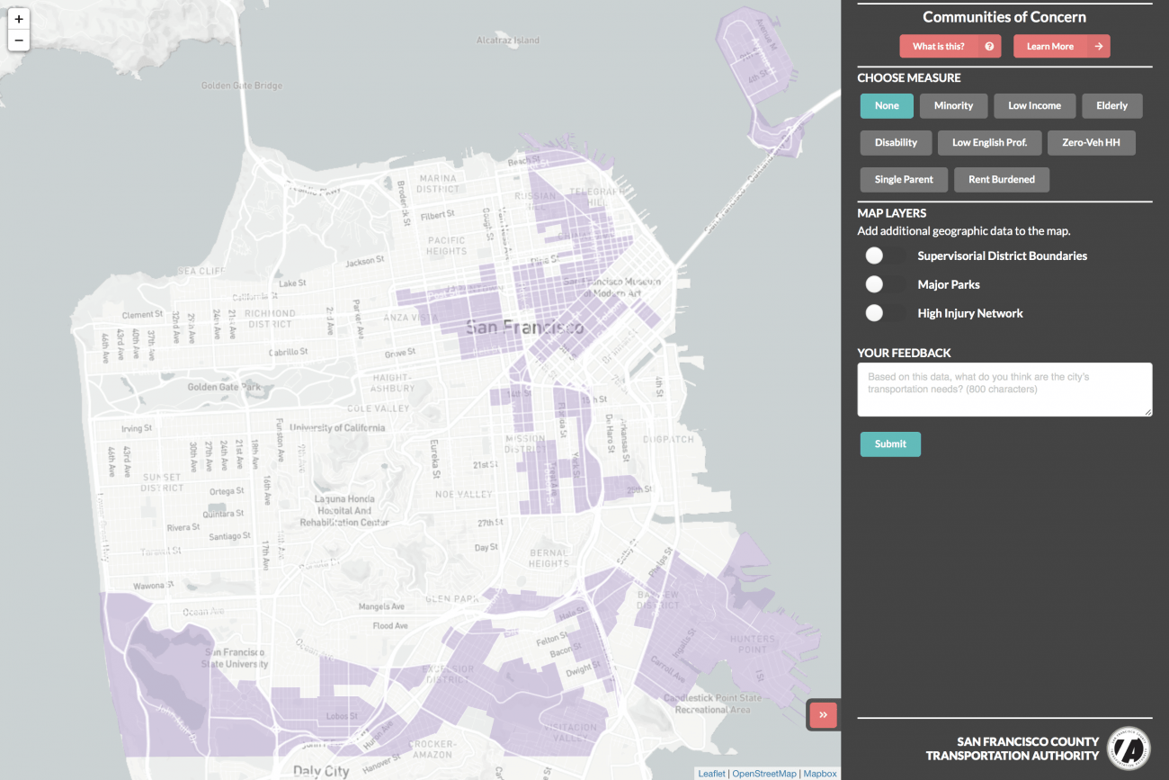
Equity Priority Communities
San Francisco’s Equity Priority Communities include a diverse cross-section of populations and communities that could be considered disadvantaged or vulnerable now and in the future.
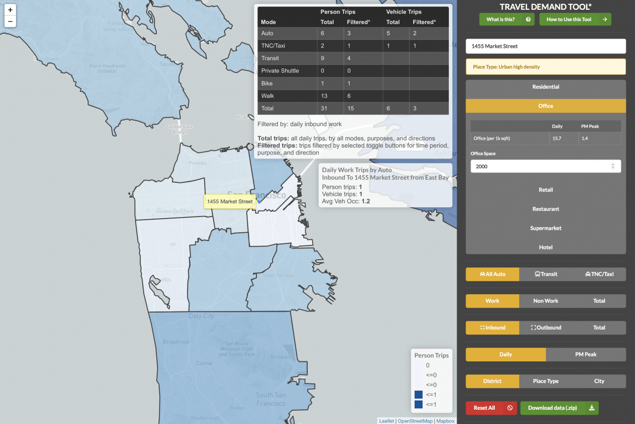
Travel Demand Tool
This tool estimates the number, type, and common destinations of new trips that people would take to and from a new development project. We developed this tool with SF Planning.
Maps & Data from Other Sources
Explore maps and data from our local and regional partners.
Vital Signs
MTC Vital Signs compiles dozens of indicators that measure regional progress on a specific topic, such as average commute time or median home price.
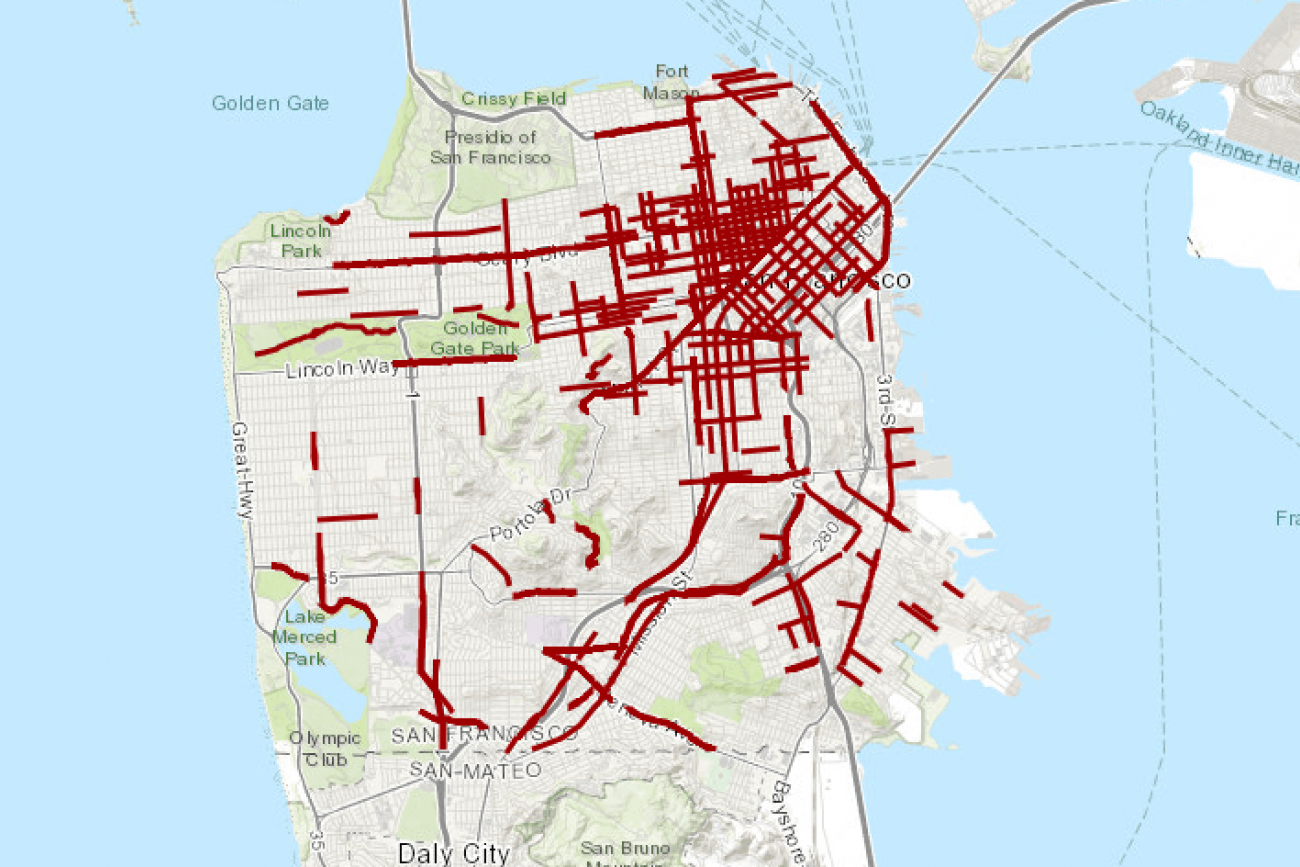
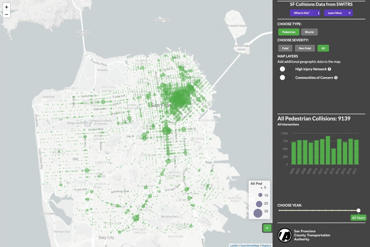
Vision Zero High-Injury Network
San Francisco's Vision Zero High-Injury Network identifies high injury corridors where targeted investments can help save lives and reduce severe injuries.